Modernist Architecture in Brooklyn College

brooklyn college

Modernist architecture can be seen on our very own college campus. The modernity of the building is especially noticeable when contrasted against the rustic buildings the Brooklyn College campus is known for. Like Le Courbusier’s Villa Savoye, the exterior of the building resembles “a box in the air” relying on sharp angles and geometric figures to give it its modernist facade. The building, like most architecture, economizes space by making maximum use of minimum space. Although this building seems to follow modernist forms, it is not necessarily modernist within and does not adhere to the white/chromatic color scheme of Le Courbusier’s building. Likewise, it differs in function: Villa Savoye is a personal residence while the West Quad is an official building which functions as a DMV (of sorts) and a gym. The two building also differ in medium: Vill Savoye is made of cement while the West Quad is made of brick.

The Gulf of Marseilles Seen from L’Estaque

IMG_3899

This is a modern painting of  The Gulf of Marseilles Seen from L’Estaque, the artist is Paul Cézanne, ca.1885. This painting uses the color red, blue mostly, and some brown and violet. The red and blue made a contrast in the painting. Red roof shows the exaggeration and the blue ocean and sky show calm. This painting looks slightly different if you have different view point, such as the top of the hill and the roof, just like Cezanne’s other painting The Basket of Apples. And the red reminds me of Henri Matisse’s The Red Studio, Matisse used red to show the inner emotion and this painting  also gives me that kind of feeling. 


Team Jupiter: Shiyin Zhao

Wacky Perspective

The trip to the Metropolitan Museum of Art showed me many branches of what we studied throughout the units of Art1010. One good example of a modernist piece is this one I found while looking through the Modern and Contemporary Art section. It’s called “Large Interior, Los Angeles” by David Hockney, and has many attributes of a modern piece. This could be considered abstract art due to it’s lack of a subject, and it’s reliance on the shape and color used to convey any form of meaning. The piece is actually a postmodern/contemporary art piece, but relates to the style of modern art extremely well. The piece also reminds me of the modernist piece The Red Studio by Henri Matisse. Both depict a sense of linear perspective, but both do it very badly. Lines drawn in both do not converge correctly, yet the illusion of a three-dimensional space in a two-dimensional space is still existent. The randomness yet harmony of the objects placed in the space are both similar in Matisse and Hockney’s work. We can see how in the “Large Interior, Los Angeles” the entire painting is painted thoroughly, and covered 100%. In The Red Studio, the white lines in the painting are actually the canvas itself. These two methods of bordering objects in a piece makes them both distinctly different.

Sean Reilly, Team Artemis (7)

David Hockney - Large Interior, Los Angeles (1988)

Cowception

IMG_0994

The Innocent Eye Test by Mark Tansey, 1981.

I came across this painting on my trip to the Metropolitan Museum of Art on Fifth avenue and 82nd Street. It caught my eye because it had bulls in it and I am a lover of cows. This work is relevant to chapter five because we talked about academic and non-academic paintings. This painting would be considered non- academic because it does not depict a historical or religious event. This painting shows a fictional event. A non- academic painting we talked about in class would be The Basket of Apples by Paul Cézanne. This painting was considered non- academic because it was a still life and they were the lowest in the hierarchy of art according to the academy. The difference between Tansey’s piece is that it is not a still life because it never actually happened.

Luisa, Team 17

Fighting the Power

This painting is called the Marguerite Wearing a Hat, by Henri Matisse. According to the text label, Matisse used his daughter Marguerite as a model in his paintings. This painting shows  Marguerite seated elegantly and regally. She seems to be turning towards the viewers to stare out at them. Additionally, Marguerite is shown as simplistic, only wearing a hat and necklace for show, even the colors are simple. Like other non-academic artists, people who went against the French art academy which focused on classical and Renaissance art forms, Matisse showed his version of his daughter instead of correct, geometric proportions. Marguerite’s face is not idealized. Her eyes and nose too big, her lips too small, and her hair very curly. Matisse also disregarded giving Marguerite fingers, which goes against the characteristics of academic art. Matisse is known to paint his model how he feels like instead of using all the rules set by the academy.

Starry Night

IMG_5735

I saw this painting when I visited the Museum of Modern Art with my best friend who came to New York City. The painting is ”Starry Night” by Vincent van Gogh. It is said that van Gogh painted this work of art while he was in a hospital. He painted it from his room but it reflects a memory of when he used to see through his window at nightfall. This work of art is clearly part of Modern Art since it ultimately does not represent anything related to religion. Modern Art is also appreciated through the experimentation of the form and the use of colors to express emotions, as it can be seen in this painting. The shortage of recognizable figures is also part of Modern Art. However, unlike other artistic works of the modern period, such as ”Les Demoiselles d’Avignon” by Pablo Picasso, this painting does not have multiple perspectives.

Jamilex Dominguez. Team Mercury.

Painting Patterns

A0A025C0-57BC-4CEE-A162-940B93893EBC.jpeg

I found this painting at the Clinic in Roosevelt Hall. I’d categorize it as abstract. It’s similar to the works we discussed in class in that the image is ambiguous and conveys emotions through the use of color and, shapes and brush strokes

Influenced by Matisse?

IMG_0895.JPG

This is my brothers unfinished painting, after seeing it for the first time I was reminded a lot of Matisse’s “The Red Studio”. While my brothers artwork is not completed the white spaces in the middle of the room unintentionally throws off my sense of depth just as Matisse’s thought out outlining of his studio does. Another slight similarity between the two works is the placement of the viewer in the same corner of the room(the bottom left) facing the top left. Lastly both artworks use oil on a white canvas. With these similarities in mind, there are also a few differences. The reason for the creation of the paintings differs greatly. My brother created his work for an art class at hunter college, while Matisse a world renowned artist was adding another painting to his studio. Another difference between the two is that in “The Red Studio” the texture of some of the objects in the rooms change, as the paintings and objects on the table are fully drawn unlike the chair, table, and clock are outlined, and in my brothers painting all the objects are drawn in the same style.

Oliver Khoury, Team Hestia

Matisse and Me

IMG_20171213_221927

Disclaimer: this picture is not very high quality, and some color may be misrepresented. In person, the mountains in the back are a lighter shade than the trees in front, and the red is not actually a gradient.


This is a painting I made in my art class in 2010-11. When we learned about Matisse’s piece The Red Studio, it reminded me of my own work because as you can see, this painting is also mainly red. Matisse used the ubiquity of the bold red to flatten his canvas and destroy the illusion of three-dimensional space that had been so sought after in previous artworks. He wanted to play around with the viewer’s perception of the depth of the image, and so he contrasted the solid background with the objects in the foreground–except that he also reversed the figure-ground relationship by painting using reserve lines. He painted red until only the white lines remained, rather than paint white over red.

In my painting shown here, I did not use reserve lines like Matisse. I painted the background red and then added the silhouettes of the trees, mountains, and islands in black over that. The effect is therefore different. However, the use of a single solid color with little exception is similar to Matisse; only the sun and its reflection in the water break the two-toned look of the scene.  This method lessens the effect of depth created by the faded look of the mountains (which the brain interprets as being due to atmospheric interference, and therefore means they are further away).

Just as Matisse did in his studio, I left out a line that would define the space. Matisse’s wall is missing an edge over the painting on the left, and my scene lacks a horizon line on the right. Both paintings assume that the viewer’s brain will automatically extend the line suggested by the rest of the painting and fill in the gap. In this case, the bottom of the mountains defines the horizon without my needing to draw a line between the sky and the water. In fact, were it not for the sun’s reflection, it would be difficult if not impossible to tell that the lower half of the scene is water. Matisse’s studio’s missing line means that it is tricky to explain where one wall ends and the next begins. The corner lacks definition, deliberately. Both his and my works experiment with depth perception and the ability to see lines where there are none.

The Red Studio was an oil painting, and this is acrylic, but both were made on canvas. Matisse created his painting to make a statement about the change in art forms, but seven years ago I was not interested in such a grand scope: I just thought this contrast looked pretty cool.

-Chaya, team Venus

Ariadne and Medea, Scorned Women

This painting just so happens to be one of the pieces that I included in my Museum report. It is called Ariadne and was painted by Giorgio de Chirico in 1913. This piece captures the essence of modern art in its rejection of the artistic styles of before. It is a far cry from Academicism, and, much like contemporaries such as Picasso, experiments with different forms that are far more simplified. When looking at this piece, I personally draw comparison to the Les Demoiselles d’Avignon because of such experiments. Like the Avignon, the piece does not hold to the traditional standards of ideal form, yet still draws influence from art forms of the past. The Demoiselles is inspired by the Archaic and Iberian faces and art styles of those time periods and incorporates those styles into its makeup. Similarly, Chirico’s Ariadne is inspired by the Greek statuary and myths of the past. While modernism is shown through a more simplified composition, that evens borders on the surreal, the woman – the titular Ariadne- lying on the stone slab and having traditional Greek robes splayed across her body, reminds us of the Classical Greek statues of women and even the earlier Kourei women of the Archaic period as well.

A major inspiration for the piece was Greek myths. Through this piece, Chirico was able to tap into his Greek ancestry, which he demonstrated through reference to the idealized Greek forms, demonstrating chiaroscuro and the story behind the painting as well. The painting Ariadne, was based on the myth of a woman, named Ariadne, who was abandoned by her lover, Theseus, on the island of Naxos. Though Ariadne is sleeping, the background and general mood of the painting invokes a sense of loneliness, isolation and betrayal. Seeing the story behind this painting allowed me to be reminded of Classics as well. In Classics, we had read another Greek story of betrayal in Medea , by Euripides. Though Medea essentially gave up everything for her lover and then husband, Jason, everything meaning her family and homeland, he decides to abandon her for another woman. Wanting him to suffer for what he did to her, she kills their children as well as his new bride, Glauce, before riding away in her snake chariot, in order to burn a similar feeling of despair into him. Ariadne displays a similar theme of a man betraying a loyal woman like Medea does. And through the modernist interpretation of the myth, the betrayal and loneliness is made all the more palpable.

Image of Medea

Skaie Cooper, Team Ares

Julius Caesar And Modern Art

Julius Caesar

This painting is called “Julius Caesar”, painted by Jake Wood-Evans. Compare to “The Basket of Apples” painted by Paul Cézanne, both art-works are using a similar technique in the process of painting. They use only one brush but applying different of colors to depict the shape and shadow of the object that is being painted. Differ than “The Basket of Apples”, the object of Wood-Evans’ painting is a Roman emperor, Julius Caesar, not daily life objects like apples, cookies, and vine. Also, Cézanne is presenting different angles of view in his art-work. For example, the left side of the table, we see it as by bird’s eye view, but by the right side, we see it as by its side, our vision is at the same level as the table’s edge. Moreover, the cookies by the upper right angle present this characteristic as well. The bottom cookies we see it flat laying on the plate, by the top are two cookies that are lifted up as diagonal. The painting “Julius Caesar” is related to Clas1110 class because we learned about him in our lectures. Something very interesting that I learned that is his first name is Gaius and he was a patrician, which means aristocrats or nobleman in Roman. I also learned that senators killed him in order to preserve the Republic from kingship. However, Prof. Yarrow taught us a very interesting point that he was actually killed by giving too many benefits and had devolved Elite competitions.

My work on still life painting

IMG_0427.jpg

This is a painting I paint four years ago. It’s a still life painting, which can be relate to the modern art we discussed in our latest art class. At the place where I studied oil painting, everyone started to draw and paint with still life scene. But we know that it wasn’t until the 17th century for artist to start value the art of still life. So here is the question, why does other teacher lets everyone start up learning how to paint with still life? I think it’s because when a scene is set, people can choose any angle to start their drawing, and when they finish, everyone will have a different version of the scene. In the reading “The Basket of Apples”, it said that “Cézanne realized that unlike the fairly simple and static Renaissance vision of space, people actually see in a fashion that is more complex, we see through both time and space. In other words, we move as we see.” And this can be the purpose of my teacher is trying to carve in our mind, that perspective is an important factor when it comes to painting.

Peaches, Pears, and Paintings Galore!

20171207_170218

While at the Metropolitan Museum of Art for the most recent Art 1010 essay assignment, I came across a gallery full of various still life paintings from different European artists. Each image contained some form of fruit, food or flower arrangement in a style reminiscent of Paul Cézanne’s “The Basket of Apples”. Both images feature a fruit-oriented centerpiece left slightly off-center from the middle of the paintings. Though Cézanne’s piece focuses more on the asymmetry and sloppy appearance of the layered perspectives within his painting, Henri Fantin-Latour’s “Still Life with Flowers and Fruit” shares the use of muted, pastel colors in the walls and the flowers much like Cézanne did with practically everything but the fruit and wine bottle. Both paintings are done with oil paints on canvas, though the similarities seem to dim from there on out. The style of each piece is drastically different both visually and in terms of basic artistic technique. Cézanne’s “Basket” is unrealistic and fairly cartoonish, giving off a vibe of unease and awkwardness via the broken lines and mismatched views of each object. Fantin-Latour’s “Still Life” is incredibly realistic and modern in feel, as proven by the appropriate proportions and arrangement of each object. The image features soft shadows and reflections of the fruit on the glossy tabletop to separate objects in the foreground and background, unlike the hard greys used to simulate what I call “flat depth” in “Basket”, where the painting itself is fairly two dimensional with what seems like a missed attempt to add distance between items. Both images, however, are meant purely for the viewer’s gaze and enjoyment as they were created with the intent to generate thought and appreciation.

– Natalie, Team Vesta

Modernized Paintings

As I was walking through the MET museum, I came across this very interesting modern painting. This painting was done by Theodore Chassaeriau in Paris which contained many realistic features. He created a feeling of naturalism by not using bright colors and keeping a calmer mood. This painting also includes very detailed features of the eyes, nose, mouth and accurate color of the skin. Overall it was a very interesting painting that caught my attention and was able to relate from my ART 1010 class when we were speaking about realistic features to a painting.

Anthony Mancuso

Team Venus

My Brother’s Final Assignment

ART blog 5.jpgThis is a still life painting by my very own brother when he took a painting class in Brooklyn College. I always saw it hung on the wall and thought it looked funky, but looking at it after Unit 5 I saw it a differently. It instantly reminded me of Cezanne’s Basket of Apples. The objects in both paintings look fake; they don’t seem to be painted with the intention of looking realistic. They both have an unorthodox approach to being a still life with shifting perspectives and slight disorder. The disorganized apples in Cezanne’s painting are parallel to the tipped over salt shaker with salt falling out in this painting and, both works have visible brush strokes,  In contrast to Cezanne’s painting this one uses vibrant and unnatural colors.Cezanne’s painting uses more earth tones and colors that actually represent fruit whereas is in this painting you wouldn’t know what is in the green bowl.

-Suman Afzal, Team Hephaestus

Fruits and Florals

For this last unit’s blog post, I decided to write about this painting I saw at the MET museum while doing the scavenger hunt.

25394054_1764194490260148_1312052998_n

This painting is called Still Life: Flowers and Fruit by artist Severin Roesen. This painting reminded me of Paul Cezanne, The Basket of Apples. The reason why it reminded me of it because they were both oils on canvas paintings, still life and weren’t religious based paintings, which were highly used during the time this painting was created (1850-1855). Instead of painting something with a religious figure on it, its main focus is on fruit and flowers. With this painting, it was focused on the lush amounts of multiple types of flowers in a vase that’s overflowing. The way he paints the flowers overflowing reminds me of how the apples were overflowing in Cezanne’s painting. There are also slight amounts of fruits hiding and growing around the vase, such as the raspberries. There are also oranges, grapes in a basket, apricots, and even a pineapple. There is also a birds nest near the pineapple and has three white eggs in it, which could have a significant meaning behind it since it’s rather hidden in with the flowers and fruits, which can be similar to how Cezanne hides the corners of the table.

-Michelle Z. Team Zeus

Other Worldly!!!

On Tuesday, Brooklyn College was hosting Puppy & Kitty Therapy at the Student Center. There was a huge line and honestly I was disappointed that the session only had dogs rather than of puppies and kitties, like how I imagined it in my head. Since there was already a huge line and I had to go study, I walked out and saw this! There is a similar one on the 3rd floor. This is a painting in the stairwell of the Student Center, found on the 4th floor. IMG_0520

Although I didn’t catch the name of the artist or the specifics of the medium, it immediately reminded me of Vasily Kandinsky’s Improvisation 28 (second version). Clearly this is a modern piece because of its abstractness and bold colors. Similar to Kandinsky’s work, this painting features bright colors, visible brushstrokes, and lines. However, Kandinsky’s painting didn’t show any depth or space. Improvisation 28 did not have a smooth appearance. It is visible that Kandinsky did not blend his paints, making it look cloudy, but it perfectly shows the state of mind he was in when painting this. Kandinsky wanted to convey his thoughts onto canvas, sometimes thoughts are clear, other times its blurry and rapid, which is evident in Improvisation 28 ‘s bold black lines and unblended paint.

The painting before you draws in the viewers attention into a space that almost seems to leap off the canvas, with attention to linear lines, that go back to a vanishing point, a focal point, and textured surfaces that gives the illusion of space. The orthogonal lines, defined by the lines around the square window, show that it goes back to a vanishing point. The textures can be seen on the swirls or waves behind the square window as well as on the ends of the columns that jut out of the window.

Both artists used paint however I believe that this artist may have used plaster or acrylic paint to form the raised waves in the background. Kandinsky used oil. Kandinsky accepted the flatness of the canvas and embraced the almost “messy” design of his creation, evident from lack of shadows and unblended paint.

Although it seems to viewers that don’t know the message of its background, Kandinsky was conveying his emotions at the time through his work. He makes the viewer move their eyes around the painting, trying the piece together what the figures could be. Maybe the reasoning for this work is similar to Kandinsky’s, trying to convey his thoughts onto canvas. Maybe it’s the artist’s brain breaking away from “the box” and thinking outside of it, embracing the waves of inspiration and individuality. Who Knows!

Joyce Chen, Team Diana

Baroque Art Metropolitan Museum

The Coronation of the Virgin, Annibale Carracci (Italian, Bologna 1560–1609 Rome), Oil on canvas

This painting is called “The Coronation of the Virgin” created by Annibale Carracci. This painting was dated after 1595 and can be found in gallery 623. According to some of the information from the label, Annibale Carracci, together with Caravaggio, was the most influential painter of the seventeenth century and the main figure in the development of classicism. This picture was painted for Cardinal Pietro Aldobrandini (1571–1621), shortly after Annibale’s arrival in Rome in 1595. In it, Annibale brought together two currents of Italian painting: a north Italian sensitivity to the effects of natural light and color, and the spatial organization and idealized figures associated with the Renaissance. Raphael’s frescoes in the Vatican inspired the composition, while the figure of God the Father was based on an ancient Roman sculpture. I saw this painting while visiting the Metropolitan Museum.

I saw many amazing paintings at the MET and this one stood out to me because it is a Baroque painting and also because it looks very complex and it took a lot of effort to make the painting look three dimensional. The story said that after Annibale got to Rome, she used the effects of light and color and idealized figures in her painting. The figure of god in this painting was based off of Roman sculpture. Especially because it is an oil on canvas painting. When I looked up the story behind this painting, it reminded me of something we read and discussion about  in Classics class. Along with the discussion of God and Roman Sculptures.

-Adam Allan

Team Ares

Manet’s style with Dead Christ

The Dead Christ with Angels, 1864 by Edouard Manet

While researching for the museum paper at the MET, I was trying to find a good example of non-academic art. In the 19th and early 20th century European paintings exhibits, I found a few examples of modernist art that reminded me of what we learned in Unit 5. While I used the Rocks in the Forest by Paul Cézanne, I was close to using another painting that was shunned by the Academy: The Dead Christ with Angels by Édouard Manet. In the painting, Christ’s body is depicted through realism and shows the body as “dirty” by casting dark shadows like dirt, in addition to the angels having more emphasis and lighting than Christ. The painting reminded me of Manet’s own Olympia painting; both paintings use draw the subject as “flat” and “dirty”. According to the text label, critics took aim at Manet’s form of artistic expression with his flatness and making Christ’s body look “cadaverous” and “mortally” deceased through realism instead of making him look heavenly and spiritually alive. In terms of differences, Olympia focuses about the prostitute’s realism with her tense expression more than the background with the maid in darker shading (not the skin color, the shading around her), while the Dead Christ with Angels focuses more on the background with the angels, bringing out the colors of the wings and their emotions, than Christ’s cadaverous body. While both paintings by Manet focus on different subject matters (Olympia on the nature of the prostitute and Dead Christ with Angels on the death of Christ), they both contain similar and distinctive features that Manet focused on in subtle and vivid ways with realism, the shading and lighting to make the subject appear dirty, and the flatness of the subject.

-A.C. Bowman (Team Saturn)

On the Website

WEB
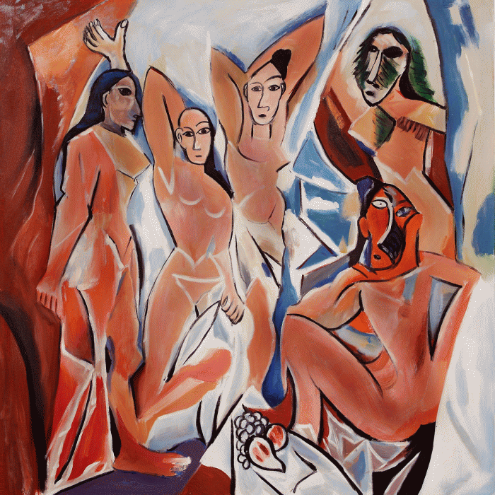
We see this picture almost every time we come on the past in present website. I don’t know the name of the artist but this reminded me of  Picasso’s “Les Demoiselles d’Avignon”. Both paintings use a lack of linear perspective and sensible lighting such as chiaroscuro. Both also seem to show reoccurring faces. They both use a sense of cubism but there is a slight difference. The panting above is less abstract and more put together in a scenery sense. Picasso includes really sharp edges and heavier brush strokes. Picasso’s painting doesn’t show a variety of colors while the one above has pops of reds and yellow.

Ivory Tyson, Team Artemis

Human Movement Captured

While looking through the art at the Met I passed a painting by Jackson Polluck.

Here is some information on the painting

Date: 1950

Medium: Enamel on canvas

Accession Number: 57.92

This reminded me of Vasily Kandinsky’s Improvisation 28 because its a very eclectic piece and both are very busy.

They are also both very similar in the context. For example Improvisation 28, is based on a musical composition which has rhythm, and for Pollucks art, it may just look like paint splatters but the description on The Mets website states “the diversity of the artist’s movements (flicking, splattering, and dribbling) or the lyrical, often spritual, compositions they produced.” so as you can see both pieces of are are defined as lyrical and speak of movement.

These paintings both resemble compositions Kandinsky’s was made to represent a musical composition made by man and Polluck’s was a composition because it was made to represent the rhythm of a human, and the composition they could create by accident. They are two different painting styles one requires brushstrokes (Kandinsky) and one is a series and drips and splatters (Polluck), but both have a very similar message, of rhythm and movement.

-Aiden Ferris

Team Artemis

Five Women

IMG_6721

During a visit to the MoMA, I recognized this painting by Henri Matisse, “Dance”. It is one of the featured works on the Past in Present Tense website! Another work hanging in the MoMA is Picasso’s “Les Demoiselles d’Avignon”. These works are very different, but they do have many similarities.

They start out with the same subject, five women. Both use the medium of oil paint on a canvas. Each of these artworks also was influenced by Matisse’s “Bonheur de Vivre”. Picasso was so competitive he created “Les Demoiselles D’Avignon” to outdue his rival artist, while Matisse took inspiration from his own work to create a whole new one. As Marcus Aurelius says in The Meditations, “The wonder of its art is that, keeping within its own limits, it changes back into itself all inside those limits that seems to decay, grow old and useless, that it makes these very things the source of new creations” (Aurelius, 8.50). Clearly “Bonheur de Vivre” was not old and useless, but Matisse still was able to transform it into a whole new creation. Finally, these are both very modern paintings, breaking from the old norms and breaking the illusion of being real.

On to the differences between these works, the subjects are not actually all that similar. Matisse creates a flowing, relaxed party-like feel that is inviting you to join in with the break between the hands. Picasso, in contrast, creates very harsh, angular figures; these women stare you down, clearly not happy that you are disrupting their time. Lastly, the perspective of both of these changes. Picasso’s women can be seen from straight on positions as well as laying down, while Matisse’s is much less obvious. You can see all the women dancing, almost as if you were above them, but at the same time you can jump right into the dancing with them, so you must be on the same plane as them. People can interpret these works very differently, but that is something that makes modern artwork so interesting, almost more lifelike and realistic than the lifelike creations of realism.

-Sheila Kelly, Team Saturn(12)

The Art of Today

20171202_134450

This artwork is titled Unfolding Landscape by Zheng Chongbin, which was created on 2015. It seems to borrow heavily from the artwork by Kandinsky titled Improvisation 28.

In Unfolding Landscape, one can see the splattering of paint, as the artist lightly slapped the paintbrush onto the canvas. One can almost see the anger of the artwork, as the splattering of the paint in some parts of the canvas show a thicker puddle of black ink, as if he slapped it instead of lightly brushing. Overall, there seems to be a rigid, yet smooth transition between the canvases, having a calming yet strict environment to it, as it’s only black and white.

The artwork, Improvisations 28 by Kandinsky shares many of these features. The artwork was based on music, as depending on the pitch and tune, Kandinsky painted different colors and shapes. For quick high notes, he’d paint a long black streak to represent that. For soft tunes, he’d paint thick soft brushes onto the canvases.

The streaks of paint on both artworks are similar in that they’re jagged or stiff, with limited movement. Additionally, there’s other forms of movement, such as big light strokes. However, there are some key differences between these artworks. In Zheng’s artwork, the colors are mostly restricted to black and white, while Kandinsky uses color to express various feelings, such as using red to express anger. The way they express different emotions yet have similar features highlights how far modernism has gone.

-Fernando Martinez

Inspired By Improvisation 28?

Unit5.jpg

As I was walking through the Brooklyn College Library this particular painting caught my attention. I felt that it looked very similar to The painting Improvisation 28 painted by Vasily Kandinsky. One similarity I noticed is how both artist take the viewer on a journey through the painting with their use of color. Both paintings have colors such as blue orange and yellow that make the viewer feel different ways throughout the painting. As we spoke about in class Improvisation 28 has certain spots where the color pops and catches the viewers attention and other parts of the painting where the colors are relaxed and calm just like the painting found in the Brooklyn College Library. One major difference I noticed between both paintings is that the painting p by Frenal Mezilas found in the Library has a female figure located on the right and is painted in blue. Kandinsky did not include any figures in the Improvisation 28. The painting makes a connection to the World War happening at the time and also makes the connection to musical composition.

Naim Nuvel, Team Vulcan

Surrealism and the Modern Era

The Persistence of Memory

Salvador Dali’s The Persistence of Memory is similar to the works of art that we studied this week in Prof. Simon’s class because of the way that they deviate from the standards of the time. Salvador Dali’s Surrealism very clearly draws heavily from Picasso’s Cubism, as shapes and normal everyday objects are shown in ways that differ quite strongly from the ways that they actually are. An example of this is the melting clocks, as clocks do not melt. This is a common theme in Picasso’s work as well. These deviated from traditional techniques as a work done with traditional techniques would have painted the clocks as well as the tree and cliffs in an incredibly and strikingly real light that would have made it look quite realistic.


-John Jacobs Team Diana

Abstract art underground

Related image

I found this art piece on my way home at 116st train station in Manhattan. This piece reminded me of Kandinsky’s Improvisation 28 with the use of shapes and lines to tell a story. This mosaic is very modern and similar to Kandinsky’s work because of the abstract format it contains. However, unlike Kandinsky painting, this is a mosaic that utilizes the abstract form Kandinsky used. This abstract mosaic was made up of different color fragmented tile pieces to create the art above.  

Hoky Tran, Saturn

Fractured Planes

The painting that I chose can be connected to Pablo Picasso, Les Demoiselles d’Avignon. They both possess certain similarities and differences with each other.

Similarities

They both have the technique of cubism. Cubism is reconstructing of three dimensional form and shattering that form and then placing those fragments back on two dimensional surface. The artists of both the paintings use cubism and prevents the use of linear perspective. There is no chiaroscuro i.e the contrast between the light and shadows in the paintings. The main idea depicted in both the paintings is the sexuality and the female nude. The bodies of the figures in both the paintings are pointy and sharp with the form of angular geometry. Although, there is no space behind the figures, there is some sense of illusion in both the paintings. In both the paintings, the female nudes have turned their gaze outward as if they want men to directly focus their attention towards them.

Differences

The colors used in both the paintings are quite different. Picasso uses very dull and light colors whereas in the other painting the artist uses very bright colors like red, blue, green, etc. The other difference is the use of brushstrokes. Picasso uses very irregular and heavy brushstrokes which takes away the fineness in the painting. On the other hand, the painting that I chose has very light and thin brushstrokes which makes the panting very fine and regular. The painting that I chose looks more modern because the women in the painting has a curly hair and wears tights and heels whereas in Picassso’s paintings, women are bare feet with simple hair.

The idea conveyed from these paintings is the sexuality and the female nudity. I can connect it to something that I learned in the Classics class. Venus was always shown as a nude figure. She was considered as a Goddess of beauty, sex, love, nudity and even prostitution in Roman mythology. Therefore, the nude figures in these paintings reminded me of  Goddess Venus.

Gurleen Kaur, Team Venus


New Era, New Art

https://instagram.com/p/BWiq_kIDYj8/

During unit 5 we learned about modern art and how it took a turn from what we would traditionally see. Paintings started looking less realistic, the subjects in these new modern painting didn’t feel like they where real, you didn’t feel like you where part of the painting. Instead this new era of paintings reminded the viewer that they where just looking at a painting nothing more. This drawing I found on Instagram is called a little light for your worries by the Instagram artist @james.r.eads.art, it’s of a girl sitting in front of a window looking out but as you can see it’s not a very realistic window or realistic background. You can see each individual stroke and different colors, you can tell this work is not suppose to look realistic.

This new style that strayed away from academic paintings started with Édouard Manet’s painting Olympia(1863). Mamet challenged the idea of the Renaissance his painting of Olympia was not perfect or of a ideal women. She was not a “Venus” or a “goddess” but she was blunt and specialized something you wouldn’t normally see. Showing that this art was not made to be perfect but to be seen as a painting. Paul Cézanne’s painting The Basket of Apples (1893) another painting that defied the academy. The perspectives, colors, and lighting made this painting less realistic.

As you can see in the old and new art works that they are both just a drawing they are not suppose to be looked at as something that is perfect and ideal. There is not proportion background or lighting you would see in the Baroque and Renaissance. However a major difference between painting such as Olympia and The Basket of Apples to @james.r.eads.art and so many other artist now a day is that they have the internet. Artist in our current era in 2017 have so many different outlets for art. With every new era their are new art forms, with the era of technology we see animation, we can draw on our computers using art tablets or even paint tool. This has introduced to us so many more opportunities to express so many art forms to being realistic or modern to everything in between.

Francesca Faiello,Team Cronos

Losing my Marbles

1347c739e1f59c92cb2e5754a902b6331c46aeee.jpgimages (2).jpgDSC_0450.JPG


By walking through the passageway between the Times Square hub and Port Authority Bus Terminal you can notice an adorable art piece by Lisa Dinhofer.

Her work Losing my Marbles showing an unusual perspective of seeing objects. As artist points out that: “ Every object I paint actually exists; I work from life. The space I create is believable – but not real. Because I design my own space, I call myself an ‘illusionist’ painter rather than a ‘realist’. The space in my work is invented. It’s flattened – like the space we see on a television or a computer screen.” So her work can be considered as abstract modern art. It really differ from other paints, mosaics from past centuries where painters focused on realism and humanism but here we see real objects but in unreal positions with incorrect linear perspective.

This masterpiece reminded me of another great work by Cezanne and his “ Basket of apples”. Similarly, those works show still life but in different space. Meaning that they were created not from one point of view but from different points because we move as we see.  Also, important to notice that apples, as well as marbles, look like they are about to fall down which also creates an illusion. In the reading about “ The Basket of Apples,” it says that Cezanne began the purposefully started destruction of a single image.

-Yuliya K.

Best Tem – Minerva

Modern Works Today

IMG_0637

This painting is called Smart Painting #1 by Luke Grey. He gifted it to the college sometime most likely after 1998. The painting has the dimensions of 66 by 65 inches with no frame. The painting is very abstract and has a wide plethora of colors. It can be considered modern in that it doesn’t follow the style of academic art. It takes all the rules such as linear prospective, foreground, background anything at all and breaks them. There are no figures and nothing can be actually made out besides some vague shapes that can change depending on who is looking at the painting. I can see a man with grey skin and a brown beard in the bottom center as well as what looks to be a bent rifle on the bottom left.

Godard, Bardot, and Satire

IMG_0039

I was in my sister’s room in my house and I noticed this poster. Le Mépris is a film from 1963 directed by French filmmaker Jean-Luc Godard starring Brigitte Bardot. The title translates to, “Contempt.”

This poster reminded me of some of the non-academic art we studied in class for our “Toward the Modern” unit, particularly the Olympia painting we studied. While she is not nude, this illustration of Bardot does have sexual undertones. Furthermore, both Olympia and Bardot are confronting the viewer with their gaze. They are painted somewhat similarly as well, as the brushstrokes in the poster are visible and there are fewer shadows shaping the figure. This poster is from 1963, exactly 100 years after Manet’s Olympia was finished, but the influence of Éduoard Manet can still be seen. There is a logical cultural connection here too, as both Manet and Godard were renowned French creatives.

I also want to connect this poster to our last Classics unit revolving around satire. Jean-Luc Godard actually made a satirical film in 1967 titled, Weekend. It is about a rich couple that essentially tries to murder each other. It makes comments on the savage nature of society and the fate of filmmaking itself, all with a dark, humorous tone. I think this, as well as our analysis of The Onion in class, shows that satire has evolved into a genre that can be seen in many different cultures, so it is interesting that we learned about it as a uniquely Roman genre in class.

Harry, Team Vesta

The Amazon Queen

IMG_20171211_182420

In classics we learned about Penthesilea, the amazon queen,  killed in  war by Achilles.  It was predistined  that Achilles would kill the love of his life and so it happened. Right as Achilles pierced the sword through Penthesilea, their eyes met. He fell in love with her right before she collapsed and died. Looking at this picture reminds of the queen right before the battle. The ferocity in her eyes and the strength seen in her posture, she was ready for war.

This piece also  is an example of modern art.  The mosaic features tiles of different sizes, shapes and colors. This mosaic also is similar to Wassily Kandinsky, Improvisation 28 in the vibrancy of colors used. The differences however outweigh the similarities. Kandinsky’s piece is considered abstract art ( not completely) and can be interpreted in different ways, while, the other art piece tells a story and leaves less room reader for the viewers imagination. Its also important to note that Kandisky’s piece is a painting, while the other art piece is a tile mosaic. The art pieces also evokes different moods. The tile mosaic shown creates a sense of excitement in my opinion, while, Kandinsky’s piece creates a feeling of disharmony and confusion. Both art pieces, though, represent modern art in different styles and forms.

Sharifa Thompson, Team Hestia

Zebra Love and The Red Studio


In this last blog post, I am going to discuss a painting from Blake Emory’s Zebra Love Collection that I saw in a gallery in Chelsea. In this painting, Emory creates the illusion of a female figure wearing red high heels on a zebra stripe pattern. The way Emory plays with depth reminded me of Henry Matisse’s The Red Studio created in 1911. A similarity that these paintings have is that both artist play with the illusion of depth by using color, lines, and form. Emory plays with form and color by using the Zebra stripe pattern and the red heel to create and emphasize the silhouette of a women that stands out from the background. Matisse plays with the illusion of depth by using the color red, bad linear perspective, and reverse lines.  A difference is what they are trying to achieve with the illusion of depth. Matisse aimed to flatten his painting rather than create depth. Matisse tries to use the color red to resist the illusion of depth. Furthermore, Matisse uses bad linear perspective to flatten the canvas. Matisse’s use of bad linear perspective can be seen in the disconnected lines of the wall and the floor and in the chair and table, whose legs get farther apart as they go back rather than get smaller. Reverse Lines are the thin white lines that are actually the canvas and Matisse uses these lines to reverse the figure-ground relationship. Matisse reverses the figure-ground relationship by making the reverse lines the figures and making the red as the ground. On the other hand, Emory’s goal with his painting is to create depth to create the silhouette of the woman and make her come off the background. He does this by playing with form by using the Zebra stripe pattern to create the silhouette of a women. He also plays with color by using the red heel to emphasize the illusion of the silhouette. He also plays with the illusion of depth by using the uneven, broken line to create the illusion of the silhouette of the woman. Both these pieces of modern art break classical tradition and experiment with forms.

Link To Matisse painting

-Emily Ryan, Team Mars (16)

Sheepshead Bay Mural

As I got off the train at Sheepshead bay station, I walked passed this mural and it caught my eye. This mural is based off of Emmons Avenue near Sheepshead Bay station and it reminded me of modern art pieces. I believe this is a modernistic art piece because of its difference compared to the Classical and Hellenistic period.  For example, the art work produced during the Classical and Hellenistic period it featured elements that made the art work naturalistic and realistic such as using linear perspective and choosing different colors to use in order to create a effect of depth in a painting. Similar to the Sheepshead Bay mural you can see that the figures featured in this art piece has depth. Viewers who look at this art work is able to see that figures begins to become smaller as they look further into the background. Adding on to why I believe this is a modernistic art piece is because it features figures of everyday people. Similar to Edouard Manet “Olympia” it features a figure of a female that doesn’t resemble religious practices and would be considered as an every day type of figure. Also, It doesn’t contain elements of a idealized nude body which is featured in Archaic, Classical and Hellenistic period. Although the Sheepshead bay mural is a more modernistic art piece it is similar to a Baroque art piece named “Elevation of the Cross” by Peter Paul Ruben, the Sheepshead Bay mural is separated into several parts but it maintains as a whole art work. But overall, the Sheepshead Bay mural has features that makes me believe that it was inspired by modernistic art work.

25397837_2024307997816482_1729918810_o

I found this mosaic on Stuyvesant Street and 3rd Ave in Manhattan. I thought this piece can used for this unit because it can be connected to Pablo Picasso’s Les Demoiselle d’Avignon. They are connected because they both use the style Cubism. Cubism emphasizes art on a flat and two dimensional services, and ignores traditional techniques like linear perspective and chiaroscuro. Besides abandoning tradition techniques, cubism is a style that depicts images in fragmented pieces. This mosaic uses many colorful stones to depict a woman in the form of cubism the way that Picasso uses cubism to help the four women in his painting to take shape. The colorful stones on the mosaic helps show light may have an affect on the color of the face instead of using shadows. This is shown with the contrast of the yellow and white stones used for the face. While in Picasso’s painting there isn’t any depth to it because of the lack of shadows.

-Alvin Zhao, Team Venus

Abstract art in the modern world

IMG_5418

This painting, which I found on the 5th floor in the Museum of Modern Art, reminds me of Vasily Kandinsky’s Improvisation 28. This painting is titled, “Dynamic Hieroglyphic of the Bal Tabarin” by Gino Severini and it is an oil on canvas painting. When I came across this painting, I noticed that it was painted on the same date as Kandinsky’s painting: 1912. Both paintings are very similar in the sense that the artists create a color synesthesia in which there is a crossing of the senses. The difference, however, is that in Kandinsky’s painting, there is music in its abstract form, whereas Severini depicts dancing to music in its abstract form. There are a lot of events happening in both paintings as well: In Severini’s work, for example, an Arab riding a camel refers to the Turco-Italian War of 1911 and Kandinsky’s work, you can see horses and riders as well as cannons being fired and biblical imagery.

IMG_1989
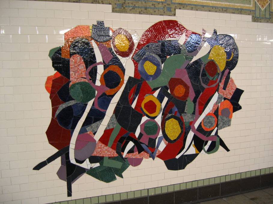
Me and a Friend were on our way to check out the puppy therapy and I stubbled  across this painting on the wall of the second floor in the Student Center. This painting looks very modern. It reminds me of Kandinsky Composition IV and Improvisation 28 with all the bright colors and a mix of lines and shapes all over the canvas. Its a flat painting. However unlike Kandinskys paintings this painting is full of dimensional images that literally pop out at you. In the right corner the squares have linear perspective.It also uses layering of paint or clay to build dimension.

-Anora A. Team Diana

Past Politics in Later Art

Classics

Image result for Intervention of the Sabine Women Jacques Louis

Jacques-Louis David (French painter, 1748-1825). Intervention of the Sabine Women, Overall view without frame. 1799 (creation), Image: 4/31/09 (creation). http://library.artstor.org/asset/SS36066_36066_23794134. Web. 1 Dec 2017.

Just like the modernist age that was discussed in Prof. Simon’s class, there is a political statement within this image. The painter himself was a man who hid many meanings within his paintings, making political paintings during the French Revolution. This was something very common in the modern age, although the traditional “fine art” techniques are still used here rather than more abstract and chaotic methods used within the modernist era. It seems the peace that the women try to bring within the image is the main interest in the subject. Further research states that he made this in a time he was jailed, where the artist stated they wanted to draw something to the more Roman aesthetic.

The quote I chose for this piece specifically comes from Vergil’s book:

“The joyful peace, which put an abrupt close to such a deplorable war, made the
Sabine women still dearer to their husbands and fathers, and most
of all to Romulus himself.”

Although even in the intervention depicted in the illustration, the war still continue to unfold, the quote shows an importance to their role.


Art

During Unit 5 we learned more about the modern world that deviated from traditional techniques. The artist’s strokes became more apparent and the subjects within the painting didn’t look like they were going to bounce out at you anymore. With that, followed abstract art, or even messy looking art that at first glance looked as though it had no purpose in a gallery, but at second glance you can see every stroke had a purpose. This was somewhat the case with Marry Cassatt’s Woman on a Bench. The artist here was trying to capture life as she saw it with the little time she had. It was a form of experimentation, which is something a lot of the modernists art had.

Now if you’re looking for something even closer to present time than that then look no further than the video games we see around us. A YouTuber by the name of The Game Theorists covered such a topic in more detail on a video called Gaming is BROKEN!  …What Comes Next? He speaks of how gaming is following the same pattern as modern art history. As time progressed, games have become more abstract and what could be considered a game or what makes a game is pretty loose with new genres being born.

We have managed to create life-like simulations within games. It looked as though you could almost touch the grass, or a video recording of the real world rather than 3D models generated through a computer. They have done an amazing job at immersing the player, making you feel like you were there, something art had striven to do. As The Game Theorist continues to point out that “…,but with so much progress and games being so beautiful and massive and textures feeling more and more real, where do you go now?”

This is where we arrive at post-modernism. All that progress and innovation removed, a rejection of modernism because “everything and anything can be art”.  We see this same idea in indie gaming today with titles such as Rock Simulator and Pony Island. These are games that break  the rules of what and how to play, and games that know their games. A trend we see in post-modernist art, where art knows it’s art. Even in some of the examples we saw in class, it was discussed that some of the artists purposely wanted you to see the painting as just that, a painting.

The difference between the past and the present is that we have become more interactive with the new art forms out there, after all even video games – something that tell stories like the paintings did – is considered art now a days.


Citations

Jacques-Louis David (French painter, 1748-1825). Intervention of the Sabine Women, Overall view without frame. 1799 (creation), Image: 4/31/09 (creation). http://library.artstor.org/asset/SS36066_36066_23794134. Web. 1 Dec 2017.

Cassatt, Marry. Woman on a Bench.1881. Pastel on Green Wove Paper.
Metropolitan Museum of Art, New York. Art History.

The Game Theorists. “Game Theory: Gaming is Broken! …What Comes Next?” Youtbe, commentary by Matthew Patrick, 26 Nov. 2017, http://www.youtube.com/watch?v=gxzKZdTxNp8.


-Yekaterina Ignatyeva, Team Cronos


Art Under My Cereal.

Screen Shot 2017-12-12 at 8.13.26 PM.png

As I was looking for ideas to use for my blog post, I came across this image hidden behind bowl full of cheerios. The image in the bowl uses color to draw viewer’s attention to the three ladies and things around them such as the trees, grass, and sky. We see drapery in their clothing, also they are depicted as young and mobile as we sense movement from the two ladies on the side. Similarly, The Death of Socrates portrays use of idealism, color, and movement. For example,  Professor Yarrow informed us that Socrates was about seventy years old before his death, but in this painting Socrates does not look his actual age but instead upholds a perfect male form and beauty. Emotion in the painting varies. For instance, as we look from right to left we see dramatic movements from the people on the right, as we get to the middle we see calm sense of emotion from Socrates who is minutes away from his death. Then we see the man giving him the drink and he seems to be in pain, and then we see the man sitting down faced away from the crowd. In classics, we determined that the man who seems to be disengaged in the scene is Plato. Looking at the clothing of these gentlemen, Socrates seems to be the most nude out of them all. This might symbolize his preparation to sleep on his deathbed. Also, David uses color to differentiate each man’s clothing, and uses Hellenistic era form of drapery as we see in three goddesses of Parthenon. However, David uses sense of light to highlight the subject of the painting. Meanwhile,  in the image above there is no sense of emotion and light. Everything in the image seems to be normal, doesn’t depict historical importance but rather an everyday life of three women.

-Amir, Team Juno

The Christmas image

20171212_184642

This image is of a glass bottle that has an illustration which commemorates christmas. I found the image on this glass bottle to be similar to Paul Cézanne’s, The Basket of Apples and Pablo Picasso’s , Les Demoiselles d’Avignon. I found that as similar to Paul Cézanne’s, The Basket of Apples, the image on the glass bottle also has a sense of destruction of the unified image. The image is not equally proportioned and up close the image seems to be out of place. In addition it is similar to  Pablo Picasso’s , Les Demoiselles d’Avignon because like Picasso’s painting, the image on the bottle breaks down the features of the body into simple shapes like circles and triangles and there is no sense of texture within the image. However, unlike Picasso’s painting which breaks down body parts into sharp, jagged, almost shattered forms, the image on the bottle is broken down into more softer shapes.

~Ashley G. , Team Juno

The real “The Basket Of Apples”

4939528672_050833185e_b

image cite: Christine und David Schmitt, Art Reproduction Paul Cezanne, August 29, 2010. https://www.flickr.com/photos/cheesy42/4939528672

This image that I found on the website was to restore the moment when the French painter Paul Cezanne painted the painting “The Basket of Apples”. the painting was painting in the time during the neoclassical time period, which in the time, still life subjects were been considered as the least important subjects that artist will use in their art. But Cezanne was one of these French painter that’s influence by the idea of impressionism from Paris, and decided to change his art style from Romanticism to Impressionism. Cezanne’s impressionism was a little different from other impressionism arts, his impressionism never took a delicate of sensuous feel, as if he was intensely to merging all the colors, surface and volume into a more unify entity, which draws attention to the idea of uniformity and planarity of the the oil paint in canvas. One thing that’s special about his painting, “The Basket of Apples” is the change in perspective of the subjects. If you look carefully, you will see the table line wasn’t flat, the wine battle was tilting, and the cookies in the back was about to “standing up”. All of these weird things are the prove of change perspective, if he only paint the painting from one perspective, the painting will looks like the image that I found on the website, which is more like other still life subject arts. why was this happened? Because in the time, Cezanne also pushed the distinction between the camera view and the human view, which he found that unlike simply static view, human’s view are in a fashion that’s more complex, in other word, the different between camera view and the human view is just the different between a picture and a movie. In Cezanne’s painting, he decided to use color to should the change in quality of the subjects though time. What Cezanne found out had built a bridge between 19th century Impressionism to the 20th century Cubism.


Yao, Team Zeus


CITATION

Dr. Beth Harris and Dr. Steven Zucker, “Paul Cézanne, The Basket of Apples,” in Smarthistory, August 9, 2015, accessed December 12, 2017, https://smarthistory.org/cezanne-the-basket-of-apples/.

Not a Venus

735D503A-7E73-4B79-9D92-EFCBA368760E

281adb6e5853d62d1e6d1933296dde956e466070
During my visit at the MET, a painting that caught my attention was Gustave Courbet’s Woman with a Parrot, 1866. It shows a woman laying carelessly on the bed, sticking her hand out, while a parrot lands on it. Her hair is spread out on the mattress and it seems like she does not give a care in the world because she is in the comfort of her own home.

Similar to Edouard Manet’s Olympia, the woman is nude and the sheets under her are messy. Her nudity is criticized by the audience because the way she poses is not idealized, but viewed as sloppy and unsophisticated. Likewise, the way Olympia lays on the bed is criticized because she is more aggressive concerning the matter of giving male pleasure through a business exchange. The way she looks forward towards the audience gives an uncomfortable and confrontational effect. The audience judges both of the women for being provocative. Since they are not Venuses, their nudity is viewed as shameful because at the time, only Venus’s (Roman version of Aphrodite) body was a form of beauty. Paintings of Venus, such as Titian’s Venus of Urbino, was an idealized nude of a woman that was targeted for the male gaze, but both Courbet and Manet’s paintings of a nude woman are ridiculed for not having any elegance and rejecting traditional conservative values of a  woman.

Although both Courbet and Manet share many similarities when it comes to criticism, their artistic style of painting are different. Courbet oil painting technique make the Woman with a Parrot look real. Her hair is very detailed and has highlights. It seems as if there is a light shining above her. He contours her body by putting shadows under her and gives definition to her skin. The audience can see the soft texture of her skin whereas in Manet’s Olympia, his painting is very flat. The audience cannot see the texture of Olympia’s skin and the only thing that Manet contours on her body are her hands, emphasizing on how dirty she is. Courbet’s painting of a nude woman portrays the woman in her most natural state, while Manet’s painting Olympia shows what occupation she does to survive; both cannot escape the harsh judgement set by societal standards.

Mary H. Team Vulcan

STILL LIFE

vangough

I was walking in the Metropolitan Museum and I found this piece relevant toward unit 5 because the style of art is still life. This painting is called Still life with Teapot and fruit created by Paul Gauguin in 1896, oil on canvas. At first the painting looks like a regular still life painting but as I closely looked at the painting, I found that the spoon looks like it was floating in a awkward position. This is related to Unit 5 because the basket of fruit looks out of place and Paul Cezanne purposely made errors on this piece of art. The same goes with The Still life with Teapot and Fruit because the artist purposely made the spoon appear to be floating, due to the shadowing. The placement of the shadow allowed the audience to perceived this piece in a new light. This subject was an expression of freedom and was the opposite of traditional art. This was a very illusionist style of art, the way the artist played with the shadows and the proportion of the fruits and apple had a big impact on both artwork. Also, they are both artworks that have no purpose except for being decorations. The painting were just ordinary stuff that people see in the real life. The Still Life with Teapot and Fruit is not a contemporary still life, so on the bottom is another piece to show the contrast between a contemporary and the source material.

Paul Cézanne, The Basket of Apples, c. 1893, oil on canvas, 65 x 80 cm (Art Institute of Chicago)Image result for contemporary still life                      
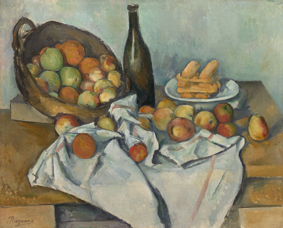
Paul Cezanne , The Basket of Apples      Jan Miller, Still Life with Nectarines, 1979.


Both artwork shows that they are a drawing a still life. On the left, is Paul Cezanne, The Basket of Apples, 1893. On the right, is Jan Miller, Still Life with Nectarines, 1979. The contemporary piece of art is different from the source material because both these art show a different view of still life. The still life on the right looks more realistic and is significantly different than the Basket of Apples.  One of them only have shades and the other have color. Also the Basket of Apples is more illusionist painting and the Still Life with Nectarines seems more realistic. The Still life with Nectarine’s medium is different than the Paul Cezanne because one is charcoal and the other is oil on canvas.

-Jia Gao, Team Athena

Are those painting really similar?

Echo, Alexandre Cabanel (French, Montpellier 1823–1889 Paris), Oil on canvas

23783241193_f4eaed8227_k


When I went to Metropolitan Museum with my one my group member. I went to the European painting department to look at some of the painting. While I was walking around, I came across this painting named Echo. The artists of the painting were Alexandre Cabanel (French, Montpellier 1823–1889 Paris). When I saw this painting, it reminded me of the painting we saw in class which was the Olympia by Edouard Manet. In Cabanel painting, it looks more naturalistic. Olympia looks more agressive to the audience. Both of the painting are very similar because they both are covered on the bottom.  The function of Cabanel painting is to dipict the nudity of her body and realism. They both were painted in a way which was to show the details of their ideal body. The differences between those two painting are that the painting of Echo painting looks more realistic because the drapes of the scarf look very realistic. Another difference is that the painting of Olympia, she is only covering her bottom part with her hand instead Echo’s is cover with very lights scarf. Also, in Olympia’s painting, there is a servant next to her who is holding a flower while Echo does not have anyone beside her. In Olympia painting, she looks like she is waiting for another customer since she is a prostitute. Her body looks flat and the little bit of dirt on some spot. While in Echo, she looks like shocked.

These paintings are actually related to classics because in classics we learned that Aphrodite was depicted as naked but Greeks would actually use nudes all the time. Also. her nudity shows the nature and power of the goddess. Aphrodite was associated with the love and the beauty.

-Mantaha Mannan, Team Vulcan


Manet and Courbet

IMG_20171129_170156.jpg

Édouard Manet, Olympia, 1863, oil on canvas, 130 x 190 cm (Musée d'Orsay, Paris)
These two works of art are similar in which they both feature a woman. In Woman with a Parrot, the artist Gustave Courbet was criticized for lack of taste by dull colors, postures, and hair texture. Courbet went against the origins of proper artistic form that were crucial at his time. He wanted to create something, not perfect or idealized but different for the viewer. While he was criticized for these factors, Edouard Manet was also criticized. His painting of Olympia was more so a rebellious movement of art. He went against the idealized Venus body, the rendering, and the perfect appeals. Manet was trying to show the true desire of a man, seen by his painting. Both painting shows a form of movement going against the true value of art and brings the connection between the artist and the viewer. Another similarities is the usage of chiaroscuro by both artists.

The rendering of these two drawings are different. While Courbet painting emphasizes more of the dull flesh of the woman, Manet wanted a more emotional appearance for the reader by the way Olympia is being portrayed. Her characteristic such as dirty hands and the origin of her name gives a feeling of normality. Such that she is the face of a true woman. In contrast to Courbet who shows more of a perfect rendering of the woman with a parrot on her hand. She seems to be more on the noble side while Olympia is seen more of a prostitute.

Most female nudes were portrayed as Venus because beauty was found in her. As Manet breaks the image of what we are so used to, the public uses catharsis to change their actual feelings about it. Catharsis is the release of a 3rd emotional element, providing relief or strong emotion. Manet used his this form of catharsis by using his emotional feelings of the beauty of art and woman to a sexual reality of his inner desires. Olympia is the product set by his catharsis as a relief of his over flow of sexual desires.

The Card players

During my free time I spent it exploring the metropolitan museum and came across this art work by Paul Cezanne titled “The Card Players”. The image is a veristic painting like other artworks by Cezanne. The painting reminded me of his painting “The basket of apples” because of how both painting had a calm and simple demeanor. The differences I found were how the simplistic nature of the card game is out of the ordinary compared to how most card games are usually loud and obnoxious. The difference between that and the painting ” the basket of apples” it would not be out of the ordinary for the objects in that painting to be simplistic and basic because it is how a normal basket of fruit would actually look like. In this painting the card players are simply enjoying their game with no issue or arguments seen or visible compared to actual card games where their is usually loud disagreements that take place.

-Al-Bishr Askar team Hephaestus

Painting with music?

I found this blog in Brooklyn College library, first floor. This painting is very similar to Vasily Kandinsky’s Improvisation 28, where they both uses the combination of music and art. In this painting, I saw houses, violins, flowers, clouds, table, and cans. I’m sure that this painting is about music is because of the violin, something related to violin I guess it must be music. Even though this painting’s style is more like the basket of apples by Paul Cezanne, but I still believe that this painting is about the combination of music and art. The contemporary work I will say would be the card that I draw in the blue circle because I believe that was made after the work had done.Inked20171211_144832_LI

Alexander and Marat

IMG_1458

This is a bronze portrait of Alexander the Great I took at the Metropolitan Museum. Alexander the Great was a Greek emperor that conquered many regions. He is widely known for his victory over the Persians and colonization in parts of Egypt and Asia. He eventually died in 323 BC but his legacy still lives on.


dav_marat

This is a painting of the death of Marat by Jacques-Louis David.  This made during the French Revolution, as many radicals were speaking out against the French government. Marat, a French radical, is seen murdered in his tub. This was due to a woman murdering him in his tub. David balances his body, as his painting shows anatomy and is secular.

These two images share similarities. Both images portray men associated with war that were viewed as heroic. Alexander was viewed as heroic by the Greeks and Marat was viewed as heroic by French martyrs. Both images are academic. The bronze portrait of Alexander is muscular and pertained to the important beliefs in Greek society. The Death of Marat is also muscular and was ideal during the French Revolution.

These two images are different. The portrait of Alexander was made to illustrate success and victory whereas Marat was made to illustrate death and the dangers that the Revolution brought. Alexander’s face is very straight and proper whereas Marat’s body is dismantled and is uneven.

This portrait of Alexander can be compared to what we learned in Classics. In Classics, Alexander the Great was portrayed as a hero that was idolized by many. This portrait is an idolization of Alexander, as his face is veristic, detailing every strand of hair and every wrinkle on his forehead. In Classics, we learned that many Hellenistic kings praised his accomplishments, as the text label under the portrait says the same thing.


Frank- Team Artemis

Barbaric paintings?

When I visited the Metropolitan Museum of Art with my group for the research paper, we stumbled upon this painting in the Modern and Contemporary Art section. This painting is called Reclining Nude and was made by an Italian artist named, Amedeo Modigliani. Although his work was inspired ‘Italian Renaissance representations of Venus and other idealized female figures,’ as stated from the art label, it reminded me of Olympia by Edouard Manet. Both paintings are swayed against classical traditions of how female nudes were represented. For instance, female nude paintings were influenced by Greek mythological figures or someone who had power affiliated with them. They also were painted with details to make a woman’s body perfect or ideal. Modigliani’s painting focuses more on her eroticism by mainly focusing on her upper body and having her eyes closed, as if she were moaning. Modigliani also ignored previous standards by painting her with underarm hair, which was not typically seen in paintings. Manet also disregards previous beauty standards of female nudes by creating a painting that is considered flat and portrays a prostitute that is waiting for her next customer. She is staring directly at the viewer and lacks the typical soft gaze that is present in female nudes.

These paintings allowed me to relate it to the concept of “the Others” that we learned about in Classics. We discussed that Non-Greeks were considered barbaric and uncivilized because they were different from the Greeks, who considered themselves perfect. There was a negative connotation towards them just because they weren’t seen as the same as they were. But although these paintings weren’t said to be bad, they still went against what was seen as ‘normal’ during a certain time period. Not to express that it’s wrong to be different from societal standards, but these paintings were “the Other” from Academic or traditional art as the “barbarians” were to the Greeks.

-Estrella Roberts, Team Vulcan

Olympia Sisters

CEC4C213-1AF1-442F-94EB-9D08B02721AEThe painting of A Woman with a Towel by Edgar Degas is found in the Metropolitan Museum of Art. Here we have a nude image of a woman who stands coyly, facing away form her spectators. The woman’s curvy figure twists in an effort to move. The sudden, sharp brush strokes gives the painting a needed shape and texture. It also creates movement and reveals the layers of color the painter used. The name, A woman with a towel, arose from what I believe the painting was made for; to appeal to the collector, specifically the men. She shows apparent form of contrapposto taken from the classical era.

I found this painting most similar to Edourd Manet’s version of Venus, Olympia. The influence of classical movement and color in both paintings create a small link between the two. The painting of Olympia is a lot more softer and lacks any added texture. It also uses more paler colors focusing on details as compared to A Woman with a Towel. Olympia is also less idealized and appealing to the viewer as opposed to Degas’ artwork. Another fact I found interesting was that Degas used his fingers to smudge and scrape his painting to give the illusion of texture, meanwhile Manet did not.

The difference between Olympia and A Woman with a Towel remind me of what we learned in classics concerning women in Roman history. These women had no position in public, and no written accord in history. They were of no importance than to be a tool in bonding families and to please their husbands. Hence, because names were really important to Romans, all the women in the family had the same name. The idea behind Monet’s painting of Olympia was meant to make the public more aware of the making of art as opposed to drawing attention to the sexuality of the woman. Furthermore, Olympia was made as a representation of the Goddess Venus. The Romans would have found this painting to be a fraud because it was to symbolize the birth of the goddess, Venus. Olympia, on the other hand, is more open with her demeaning gaze. She would seem notorious for the way she looks directly at us as compared to the woman with a towel who shyly averts her gaze. Olympia’s hard gaze would have been thought as atrocious to the Roman men because they would not even have seen a painting of a nude woman.


Khilola, Team Juno

There’s Something About The Atmosphere…

whyyy    some craziness

The picture depicted to the left of Jacques-Louis David’s “Death of David” portrait is from the Metropolitan Museum of Art, in Manhattan, New York City, and is titled, “Everhard Jabach and His Family,” by French Artist Charles Le Brun. This incredible piece is in some ways similar and different to the French Revolutionary’s political piece. They both exhibit extremely alike traits in structure, while also displaying different characteristics to the other.

Summary of Le Brun’s Painting: The artist portrays Jabach’s interests by combining the wealth and popularity of Dutch and Netherlands Art. The artifacts around the disarrayed room are not all French, but the organization with which things and persons are organized reflect on French portraiture. The main subject of the painting, Jabach, is accompanied by his wife and children.

The two paintings display multiple similarities. Firstly, they both possess the same medium: were painted with oil on canvas. The use of this medium allowed the artists to create luminous blends with colors, and show significant contrasts between elements of the piece. Furthermore, they are similar in that they both exhibit the chiaroscuro technique. This technique, which is the contrasting of light and shadow created by light falling from a particular direction, is shown in both artworks. David’s piece demonstrates the use of chiaroscuro, sometimes called tenebrism, with light shining from somewhere in the middle of the western part of the picture (left side), creating shadows on the right side of the image for Marat’s body, the sheets and the letter. Similarly, Le Brun’s piece shows of this technique with a light source from the left part of the picture, resulting in shadows appearing for Jabach’s collectibles and his family.

The paintings display multiple differences as well. David’s “Death of Marat” Painting just comprises of his old, slain friend, in a tub with a note. In contrast, Le Brun’s “Everhard Jabach and His Family” contains Jabach, his family, his Dutch and Netherland collectibles which he admires dearly, and his dog. These two differences are essential in introducing a next major difference between the two. Le Brun’s piece has a sense of tranquility and togetherness, with both his family and his prized possessions, meanwhile David’s has a much deeper atmosphere; it is one of grievance and injustice.

Jacques-Louis David’s painting relates to Classics in a very unique way. This painting was composed in a time of political uproar in France. David, who was part of the revolutionary group known as the Jacobins, contributed a great amount to the spreading of the ideals of the revolution, but this group was later squashed by the French Government due to issues within the rebellious group. Fortunately, David was jailed, instead of being executed like many of the others. He was later released by France’s new ruler at the time, Napoleon Bonaparte. The young, “great” general could be compared to one of the most powerful leaders we have learned about in our Classics class, Alexander The Great. Both leaders are related in their success and respective reigns; Alexander, although young, conquered a great deal of the world that was known in his day and was well-respected for his military and diplomatic intelligence, while Napoleon, also young, had a long string of military victories, including against the likes of Belgium and Austria. They both are seen as great leaders.

-Daniel, Team Diana.

Tremendous Amount of Red!!!

During my trip to the MET, I took a picture of “Red Coat” painted by Alex Katz in 1982. This painting immediately reminds me of “The Red Studio,” painted by Henri Matisse in 1911. “Red Coat” and “The Red Studio” are similar because the main color is red. Also, both paintings are painted with oil on canvas. However, there are several differences between “Red Coat” and “The Red Studio.” One clear difference is that “The Red Studio” consists of many of Matisse paintings inside one. However, “Red Coat” is a visual of a woman with straight black hair wearing a red hat, a red shirt, and red lipstick. In “The Red Studio” Matisse didn’t get the perspective wrong. He purposely painted it the way he wanted it. He flattened the perspective in the room, and altered it from how we perceive perspective with our eyes. As one can see, there are white lines in which outline some of the objects in the painting. He did not paint white on top of red but painted red up to the borders of the forms he was defining. The white is painted underneath the red, which is called reserve line. In the “Red Studio,” there’s tension which animates Katz’s depiction of both people and space. It’s an enigmatic portrait of his wife Ada because we don’t know what she is thinking. 

Mohammed, team Vulcan

CuBISm


Pablo Picasso: Les Demoiselles d’Avignon v Dr. He Qi Around the Hood: The Art

The artwork I chose for my blog on Unit 5 was “Around the Hood: The Art” by Dr. He Qi. I got it from Trinity Church’s First Sunday of Advent bulletin on December 3rd, 2017. I remember in Unit 5 we discussed modern art and all its styles and techniques. We learned about the turning of the century and how artists during that time period went against traditional conventions in efforts to create their own movement. One technique we learned about and resonated with me was cubism. Cubism is an early 20th-century style and movement in art, in which perspective with a single viewpoint was abandoned and the use of geometric shapes, interlocking planes, created what should be three dimensional, two dimensional.

Similarities

Around the Hood: The Art” by Dr. He Qi is similar to the Pablo Picasso’s painting we discussed in class: Les Demoiselles d’Avignon. Both pieces look almost identical. They both have three-dimensional objects and shapes incorporated as two-dimensional. Both artists were inspired by African art. They both have the mask-like faces in their artworks. This also emphasizes the use of cubism both artists used. I did further research on He Qi and found that most of his work follows this cubist movement. I wouldn’t be surprised if Picasso was his inspiration. Qi and Picasso’s works shared the same cubist structure: bright colors, sharp edges and larger than life images. Both pieces have the tribal African feel to it. From both pieces having bare feet to them both incorporating something of African culture. Pablo (mask, cloths) Qi (mask, both instruments). One could say these two are the same artist from different time periods.

Dr. He Qi’s Other Cubist Works:

Pablo Picassos Other Cubist Works:

Differences

The paintings differ in their objects and message. In Picasso’s painting, he shows five prostitute women in a French brothel. He Qi’s piece is more angelic and beautiful. It depicts two ladies that could be angels. They give off a soothing and appealing vibe, unlike Les Demoiselles d’Avignon. Neither piece expresses the same kind of imagery or dimensions. Picasso paints the five prostitute women with distorted or unappealing faces with more confusing body angles and placement. He Qi’s use of cubism is all in your face. His painting has a more intimate feel; the focus is on the figures and what they represent alone. Whereas Picasso’s use of cubism is a little subtler. Picasso’s painting focuses on distorted images of nude women and the message the setting collectively depicts.

Shamiso Tunduwani, UNIT 5, Team Jupiter

Impressionism

img_3939.jpg

I took this picture a few weeks ago when I visited the MET museum for my final paper. The title of this painting is Fleur de Lis, and it is painted by Robert Reid in ca. 1895-1900. I found this painting interesting because the colors are not blended fully together, and it somehow makes it pretty. Also, minimum colors are used in this work. The medium used for this work is oil on canvas, which means that the texture of the paint can vary depending on the artists’ purpose.

Before the creation of this painting was Paul Cezanne’s, The Basket of Apples. Cezanne’s work is considered to be a post-impressionism art style, a style that is against academic paintings or paintings with the classical traditional art style. Robert Reid “…was among the founding members of the Ten American Painters, a loosely defined group of French-trained artists associated with impressionism” (Metmuseum.org). He was most likely influenced by Cezanne’s post-impressionism art style. Some features of impressionism are the way the colors are not fully blended, the visible brush strokes, and the tiny hint of abstract within the leaves.

Becky, Team Hera

So much red!

For Unit 5, we read and learned about Henri Matisse’s The Red Studio which is shown on top on the left side. Matisse’s painting was finished in 1911 and is oil on canvas; it can be found in the Museum of Modern Art located in New York. We can see just by looking at the painting that the main color is red hence the name of the painting which is mainly what we will be focusing on for this blog. The right side shows another painting done by the artist Mark Rothko and this painting is called No. 21. The medium is a little different than The Red Studio painting since it is oil and acrylic with powdered pigments on canvas instead of just oil on canvas. No. 21 can be found in The Metropolitan Museum of Art and was created in 1949. I thought these were perfect mainly due to the color which we see red in both of these paintings. Red is said to be one of the most aggressive colors so Matisse used the color red to attempt to resist the illusion of deep space. This actually does not work out because the red becomes the walls of the room seen in space. For Rothko’s work, he wanted to explore abstraction by painting squares in very delicate colors which the chose to use this blue color underneath the red. Whereas Matisse used a color underneath which was white, the canvas started off white and Matisse just painted red on top. Matisse tried to reverse the figure ground relationship which I am unsure if Rothko was trying to do this but there is no sense of illusion in space in Rothko’s painting but Matisse’s painting just has really bad illusionism.

-Raine, Team Jupiter

Lucretia and Olympia


Lucas Cranach the elder. Lucretia. 1532. Akademie der Bildenden Künste in Wien, inv. 557.. http://library.artstor.org.ez-proxy.brooklyn.cuny.edu:2048/asset/LESSING_ART_1039789025. Web. 9 Dec 2017.

The work of art I found is entitled, Lucretia it was created by Lucas Cranach the elder in 1542 and is a painting; the medium is distemper on wood. The description relates that’s the painting depicts a “Roman noblewoman and wife of Tarquinius Collatinus, [who] killed herself after being raped by the son of Tarquinius Superbus, last King of Rome.” The artist Lucas Cranach the elder is German (Western) and the year competed is during the Renaissance. There was a re-emergence of the significance of female nude as a genre during the renaissance in Western art.  Though it is supposed to be a somber scene, Lucretia is painted nude, distracting the audience with her idealized body. She appears soft which enhances the sensuality and sexuality of the piece. She is standing in contrapposto and a motion like stance. Also she is holding an extremely sheer piece of fabric in her left hand as it rests over her right forearm and the sword that she is soon going to drive into her chest is in her right arm. In her face we can sense her sorrow, tilted head and her drooping sad eyes gazing off into the dark space. The background is dark almost black, adding to the dramatization of the scene.

In Edouard Manet’s Olympia of 1863, though it is three centuries after, the female body was and still is objectified in art. It is viewed and represented as a symbol of fertility, sexuality, sensuality, and seductively. This tradition goes all the way back to the ancient Greeks and Romans. Olympia is a prostitute and unlike Lucretia, her body was not painted to be idealized or perfected. Manet challenges those established ideas and simply paints a real woman in an apartment in Paris. Instead of standing like Lucretia, she is laying down. She is painted to look quite flat and angular and we can’t see any brushstrokes. Unlike Lucretia, Olympia is gazing directly at us which blatantly emphasizes her sexuality.

Livy book 1 describes the account of Sextus Tarquinius raping Lucretia and her suicide. It all began with his obsession with Lucretia. One night when he along with other young princes were drunk, Livy states, “Not only her beauty but also her proven chastity spurred him on” (Livy 161). When he caught her alone, he threatened to kill her if she didn’t sleep with him and murder a slave and place him naked next to her naked as false evidence that she committed adultery and to ruin her reputation. So, she allowed him to rape her, called her father and husband afterwards and told them what had happened so that her name wouldn’t be tarnished. The account goes on to say that they found her sitting, with tears in her eyes quite different from Lucas Cranach the elder’s rendering of her. Also unlike the painting, she wasn’t alone when she killed herself as others were attempting to console her  by, “shifting the guilt from the woman who had been forced to the man who had done the wrong” (Livy 164). One last difference between the painting is that while she is nude in the painting, the literary version describes her to be clothed. “She took a knife that she had hidden in her garments and plunged in in her heart” (Livy 166). I infer that the artist made this choices to add to the dramatization of the scenes depiction and to the sensuality of Lucretia.

– Chanté, Team Venus


Modern Art

20171119_140633

For this blog post on modern art I chose The Thinker by Rodin from The Metropolitan Museum of Art. This piece is considered modern art because it is based on classical tradition but Rodin differs from the typical style just enough that the viewer of the piece does a double take. This is similar to Manet’s Olympia. Olympia by Manet was based on works such as the Venus of Urbino that portrayed the female nude in a soft way with great detail on the body. Manet made Olympia glare at the viewer harshly and she was painted in 2D except for her hands and feet. The painting was considered fairly unpleasant to many viewers. Similarly, Greek nudes are often portrayed doing something physically impressive. The Thinker is just sitting and thinking. This makes the statue differ from the statues of antiquity and thus making it modern art.

Hinda Honikman

Bright Colors that Enrapture Enviornments

This photo I took in a museum features a work that draws heavy visual similarities to Paul Cezanne’s, The Basket of Apples. Both works use a variety of bright colors in order to convey the verism of their respective environments. Their is a certain degree of realism and naturalism in both of these paintings however the realism isn’t amplified to the point of it being lifelike. It instead feels classical and emits a nostalgic tone with the inclusion of nature’s products such as trees, grass and apples. Additionally, both paintings have a certain emphasis on shadows which highly emphasizes the realism aspect.

While both works certainly have their fair share of similarities, there are still a couple of key noticeable differences. For instance, the work I chose is rather vague and not intricate with its shadow incorporation or shading while Cezanne’s work definitely is, at least moreso than this work. Cezanne’s work doesn’t use as many shadows but they are realistically placed such as the right of the table near the apples and the shapes are more intricately and vividly drawn in as well. Also, both works have a differing semblance of brightness. For example, the work I chose is more bright due to its outside atmosphere and the sun’s likely inclusion in it. Cezanne’s work on the other hand is bright as well but the painting takes place in a room and the brightness of the apples doesn’t overtake the brightness of the image that I chose.

Bailey Seemangal, Team 5, Hephaestus

Flower on the Water

IMG_20171207_180606.jpg

This is an artwork that I found in the Brooklyn College Library. I found it relevant, because it looks like a Post-Impressionism painting. It didn’t have a text label telling me the artist or what date it was from. The similarities of the artwork from are the lines around the flowers that created almost a cracked-like contrast. You can see the way the artist worked the brush strokes, because there is not a lot of details surrounding the flower to tell what it is, creating an abstract form. You can’t clearly see what the flower is on. It could be on water, because the brushstrokes is creating almost a ripple effect and you see the reflection of the flower below. The difference is that the flower, itself, is almost realistic, it has more details than the brushstrokes around it. Most post-impressionism paintings don’t have a lot of details on figures or objects, while this flower has shadows, highlighting, and details on the petals, giving you exactly what it is.

Caroline Snyder, Team Cronos

Cones of Relationships


fullsizeoutput_c1

This painting I found on the 2nd floor of the Brooklyn College Library is called “Cones”. It is oil on canvas, painted in 2003 by Asya Dodina and Slava Polishchuk.

When I looked at this painting, it reminded me of Vasily Kandinsky’s “Improvisation 28”. Kandinsky’s painting is a kind of musical composition that is done so with form. It’s title too, is a kind that musical composers use. Kandinsky’s painting uses synesthesia, which is the idea of crossing senses so that by looking at his painting, one would see beyond their eyes, and hear something. His painting sounds like a dangerous and chaotic, yet brilliant moment. He uses black diagonal lines and bright colors for their own sakes. The colors are like musical notes and the lines create rhythm. His painting represented the effect of the political chaos in Russia before World War I on Kandinsky. His painting is a composition of his “inner necessity” to express these inner feelings, which he does with his bright and chaotic composition.

That “inner necessity” can also be identified here. When looking at this piece, one feels a similar chaos present in Kandinsky’s painting. The cones are outlined by black lines and the inside of the cones are colored red, black, or grey. My interpretation of these colors would be that some relationships are of love (red), some of hate (black), and some a confusion of in-between those two (grey), but none of these cones are entirely one color, representing that no relationship is of one emotion. And then the cones are interconnected, falling into one another, representing human connections. There is one red human cone leaning into another red cone, and a third black one turning away. The cones, colors, and lines create powerful feelings in the viewer beyond the eyes, where viewers can sense human interactions and can feel the connected emotions to these types of relationships. The “Cones” represent the artists’ inner feelings of relationships; the complexity, beauty, and unpleasantness of human relationships.

While Kandinsky’s painting is more of a representation of a historic time of political chaos in Russia before World War I, this painting of cones is more universal, representing an aspect of life that all humans share. The complex nature of relationships, of love, hate, and a grey-area of other feelings, is portrayed here in a similar yet distinctive sense.


Isra, Team Minerva

Plums..?

IMG_0576.JPG

Title: Still Life with Plums

Date: 1666

Artist: Pierre Dupuis

Accession Number: L.2002.58

I took a picture of this oil painting at the Met museum during my scavenger hunt. It is an image of a bowl of plums. This is considered to be a still life painting because the subject in the work is an inanimate subject matter. The painting include natural and man-made objects. The plums are an example of a natural subject matter in the painting because they are grown from a plum pit. The bowl the plums are in and the table the bowl is on are both man-made subjects because they can not be found in nature. This painting is from French culture, and was created during the late 1600s. What stood out to me in this piece was the dark background because it puts the viewers’ attention on the plums. This is known as chiaroscuro because viewers can see the sharp contrast between dark and light in the painting. Another thing that stood out to me was the fact these were plums because I thought they were grapes because the fruit was still attached to the branches.  This piece relates to our class because in Unit 5, we learned about the unpopular art style of still life. In class, we learned about Cèzanne’s “The Basket of Apples” oil painting. This is an painting of a table that is set with multiple fruits and a wine bottle. You can see the relation between both works of art because they can be classified as still life paintings since the subject of both works of art are inanimate. This style of art was not popular with people because there were more popular styles of art that resonated with the people, such as historical and religious works of art, and there were cameras that were around at the time. That is why artists of this era, like Cèzanne, wanted to show the power of the human eye. They believed that the camera was no match for the human perspective because despite their high quality photos, it can never be the same as the human eye. Therefore, that is why artists painted everyday inanimate things onto a canvas, which is seen in both the “Still Life with Plums” and  “The Basket of Apples”.

  • Rebecca Lee, Team Jupiter


Rainbow Abstract

abstract

This is the abstract painted by my friend Paulina. She is very talented and has an amazing talent to create great work of art. This piece was painted on one of her workshops called Open Your Heart Through the Painting on November 24, 2017. She painted on canvas and used acrylics. I took this picture at Awakening – the place we work. The similarity between this abstract and ones that we talked about in class is that it presents something that was in the artist’s imagination and everyone can describe it in a different way.  She put her heart and personal feelings in it but from my point of view, it looks like colorful abstract which contains a lot of happiness and joy, which I can assume she felt while painting. The difference is that this is a small painting compared to others from the period of modernism, which are way bigger in size. It also differs because usually artists take many days to paint, but she did it in one evening.

Edyta, Team Aphrodite

The Brooklyn College Kandinsky?

IMG_2502

I saw this piece in the Brooklyn College Library on my way out one night. This piece is acrylic on canvas and it is called Smart Paint #1. This piece was made by Luke Gray in 1998 and is part of The Brooklyn College Collection. When I first saw this it reminded me a lot of Vasily Kandinsky’s second Improvisation 28. Although Kandinsky’s piece is oil on painting while Gray’s is acrylic on painting, these two paintings do have commonalities. One thing that captured my eyes from Gray’s work is the variety of colors he used. From a certain angle, one can say that the colors are chaotically placed all over the place, but I see some kind of order. Also in Kandinsky’s second Improvisation 28, it also looks a little chaotic, but there are actual paintings of objects embedded within his work.

-Izadora, Team Aphrodite


Trends in Contemporary Art

This is a painting I found in the Metropolitan Museum of Art called The Card Players painted by the artist Hale Woodruff. The painting is similar to the Pablo Picasso’s painting we discussed in class called Les Demoiselles d’Avignon.  Both artists were inspired by African art, masks in particular. They both paint the faces with the image of African masks. Both paintings are striking and surprising. They’re western art pieces imcorporating African arts. This is know as modern art. Contemporary artist are breaking ‘rules’ and making the art that is important to them. The paintings are different in the subject. In Picasso’s painting is of the prostitute women of the alley. He paints them with distorted faces and models some of their faces after the masks. In Woodruff’s painting, the subject is two figures (who appear to be male) sitting at a table and playing cards. The painting has a more intimate feel, the focus is on the the figures and what they are doing, while Picasso’s painting focuses on distorted images of nude women in an open setting. 

Gabriella, Team Hestia 

Early Spring and Related Works

CAM00806.jpg

On the left, my bookmark depicting “Early Spring”. And on the right, the original by Koleman Moser.


Image result for early spring. illustration to a poem by rainer maria rilke.

I was cleaning my desk when I came across this bookmark. It shows how by the 19th and early 20th centuries, the classical ideals had disintegrated, giving way to decorative arts and new styles which were not concerned with realism. The book,ark depicts “Early Spring” by Koleman Moser, made in 1901 to accompany a poem by Rainer Rilke. Moser created this piece during an art period known as Art Nouveau, which came approximately half a decade before cubism. Already we can see the drastic shift from realism to abstract, especially with the patter in the background and of the boarder. The woman on the bookmark is also very minimalist; she is almost drawn in silhouette, with no detail.

“Early Spring” by Koleman Moser reminded me of a very famous painting of the same art period. “The Kiss” by Gustav Klimt is also highly decorative and not concerned with proportions. Rather, Klimt uses the vibrant gold to create a cocoon around the couple, and the flowers and patterns to beautify the painting. Both Klimt and Moser use

Image result for the kiss klimt

Above, “The Kiss” by Gustav Klimt. On the right, Picasso’s “Les Demoiselles D’avignon”.

geometric shapes, like squares and circles. Also note how unshapely the bodies of the subjects in both pieces are. Reminiscent of Picasso’s “Les Demoiselles D’avignon”, the artists don’t rely on accurately represented images to convey messages to the viewer. For example, some argue that the use of the vibrant gold by Klimt alludes to Byzantine art and the flowers and hair form halos around the embracing couple, giving the painting a sense of divinity; similarly, Picasso used African masks in “Les Demoiselles D’avignon” to convey danger. Since this kind of imagery is not apparent in Moser’s Image result for les demoiselles d'avignon meaning“Early Spring”, the viewer would most likely have to read the accompanying poem to get a sense of the art work itself, or analyze the work in a non-conventional way. In this way and because it’s break from the classical depiction, “Early Spring” can be considered a modern piece.

Elene T., Team Mars


Glass Puzzles


This photo is of Pablo Picasso’s 1911 “Pipe Rack and Still Life on a Table,” at the Metropolitan Museum. The painting is located in the “Modern and Contemporary Art” gallery, and is one of the early works that explored and redefined art. Dating back to the early half of the 1900s, many artists began to move away from the traditional techniques and features of academic art. The classical traditions of religious, historical, and mythological images were rigid. Therefore, artists like Picasso began experimenting with different ideas of style.

In this painting, Picasso begins to form what we call today cubism. Although the title and text label mentions that this painting is of a still life, it’s hard to distinguish. The simple lines and geometric shapes almost create a puzzle of broken glass fragments. The shapes overlap, but do not evoke a sense of depth or dimension. Despite the shadows of the shapes, the image is mostly viewed as two-dimensional. There is no particular subject to the image, besides the supposed pipe rack at the top left of the painting. Picasso also uses words in this painting to make reference to literature and his patron, something that is not used to express ideas in most artworks. Overall, the painting is taking the typical idea of still life paintings, and making it more abstract. There is no definite shape to be able to identify the still lifes, so the viewer’s  consciousness does not overpower their initial emotions. Instead, the viewers must interpret the painting without their preexisting connotations of the still life.


Vicky Lee, Team Hermes


The Fruit Basket

In 1893 still life portraits were considered to be one of the lowest type of subject form in the art academic world, but even so Paul Cezanne decided that still life was going to be his main focus, something he would leave his signature on. From that time in 1893 to now 2017, I can say that opinions regarding still life paintings have changed by much considering that there are many forms of still life portraits placed in museums today. One of the current assignment for my art class required I visit the Metropolitan Museum where I saw his painting and many other forms of still life portraits done by other artists. But even so, it so happens that Cezanne’s version of still life paintings are not only famous in museums but also appear frequently on the walls of many kitchens, for example mine. Purely by accident, my family decided to redecorate the house for Christmas, and among the items bought sat a lovely painting of a spread of fruits. In the painting a tea pot of some sort can be seen sitting in the back while the grapes are draped over the other fruits. One of the thing that drew my attention to the painting after comparing it with Cezanne’s version is that the lighting and shading the artist used looks more natural than Cezanne’s. The shadow of the teapot can be seen on the wall and the fruits in the back are darker than the ones in the front. Knowing what I do now, I am honored to know that in my kitchen hangs a version of the famous Paul Cezanne’s still life portraits.

Still Life with Apples and a Pot of Primroses, Paul Cézanne (French, Aix-en-Provence 1839–1906 Aix-en-Provence), Oil on canvas20171211_184605.jpg


cubism found in LES

24623850_1513975985384585_1766911614_o

In unit 5 we learned about modern art and all the styles and techniques that modern artists used in their work. We learned about how they rejected traditional conventions of the past and instead opted to create their own. One technique that was spawned out of all this was the technique known as cubism; which is a style of painting and sculpture characterized by an emphasis on formal structure, the reduction of natural forms to their geometrical equivalents. Basically it’s when you shatter what a three dimensional object looks like on a two dimensional surface, pick up the fragments and put them back on the two dimensional surface. This piece of street art that I found in the Lower East Side of Manhattan, in my opinion, expresses this style of art perfectly. It incorporates three dimensional objects and shapes as well as their fragments to create itself.  This piece reminds me of Pablo Picasso’s Les Demoiselles d’Avignon, as both works incorporate the style of cubism. However, this piece differs greatly from Picasso’s in the way that it doesn’t express the same kind of imagery or dimensions. In addition it uses more straight forward three dimensional objects and their fragments whereas Picasso’s use of cubism is a little more subtle.

Modern Art

This is an image of the cover of the book Norman Street by Ida Susser. This cover of the book corresponds to our class because does not try to emulate academic art.

Similar to other art we studied in this unit, this painting does not conform to the tradition of the academic painting. The subject here is not a portrait neither a cohesive scene. Rather it is seemingly unrelated pieces contained in a single work. Similar to Picasso and Matisse’s  painting, there is no cohesiveness of space in this work. and we also see a brilliant use in color to define the form.

However, unlike the paintings we studied in the class, this is not a painting but a mural. specifically a picture of mural which inturn is used as book cover. Also unlike the art we studied, this mural is not really flat. The face of the women and the monster does have depth and a sense of realness. However, the blue complexion and the shapes which almost seems abtracted reminds us that this is paint and the artist is not trying to pretent otherwise. He takes liberties that would not be taken in painting academic arts and the spirit of this painting is very modern.

Masuma, Team 18.

Unit 5: The Modern World

I chose this image titled “Oath of the Horatii” by Jacques-Louis David painted in 1784. It tells the story of the dispute of two cities, which must be solved through battle by the champions of each group. One group is called the Horatii brothers and the others are the Curiatii brothers, and one of the sisters of the Curiatii is married to the Horatii which invokes anger between both groups. A fight is ensues, at the expense of the women involved. This piece has asymmetry, naturalism, pastel colors, and a delicate like feel and a watery form. It can be classified as neoclassicism also, which is how it can be compared to another art piece, “The Death of a Marat.” Both pieces, may have been indirectly influenced, or influenced by the French Revolution, in regards to the violent nature portrayed in each scene, which speaks volumes. Also, the time period in which both works were created, was during a time of war. The Oath of the Horatti, was created during the time of the wars between Rome and Alba, while “The Death of a Marat” was created and influenced during the course of The french Revolution.

The Wolf Stands Alone

     2017-11-28 (4)

     The sculpture above portrays who the Roman people once considered to be the founders of Rome , Romulus and his brother Remus.Romulus and Remus are curdled in the furs of a wolf due to the understanding that it is believed that the wolf acted as their mother and raised them , when they were abandoned as infants..This is proven because in the text it says “the boys had been exposed had been left by the retreating water on dry land, a thirsty she-wolf from the surrounding hills, attracted by the crying of the children, came to them, gave them her teats to suck and was so gentle towards them that the king’s flock-master found her licking the boys with her tongue”. This sculpture is an accurate portrayal of  what actually happened in history and the text The only difference is that the infants were discovered by the Tiber river and the sculpture doesn’t acknowledge the importance of the surrounding history about Romulus and Remus. The artist contributes raw history to the artwork and it can be shown that the origins of Rome is important for the artist to convey.

Correspondingly, this relates to what we are learning in art in that these ideas are portrayed in modern art.

Screenshot_20171210-173152~2

This shirt portrays a modern more abstract almost surrealist view of Romulus and Remus. It is s considered surrealist due to the fact that it isn’t a solid picture, but an artist creative interpretation of it.We can tell due to the fact that the baby forms are created from a series of lines.Of course this is different compared to most surrealist art in that it isn’t a completely unique idea or portrayl.Additionally, this can also be compared to The Red Studio by Mattisse in that it uses but the use of lines and negative space to create a concept.

Samantha, Team Minerva

Citation

She-wolf nursing Romulus and Remus. 16th century. Musée du Louvre, inv. M.R. 1649.. http://library.artstor.org.ez-proxy.brooklyn.cuny.edu:2048/asset/LESSING_ART_10311441198. Web. 28 Nov 2017.